Equipe
E-Commerce Website
The Company
Equipe is a company that sells bikes on their e-commerce website. They needed to enhance their browsing and checkout experience to greatly improve their e-commerce website’s usability.
My Role
As the sole designer on this project, I performed the landscape research, branding, the wireframing, prototyping, and usability testing.
Type
E-Commerce Website
Duration
4 Weeks
Tools
Sketch, Invision, Marvel
Role
User Research, UI Design, Branding, Wireframing, Sketching, Prototyping, Usability Testing
The Brief
Equipe needs to improve the conversion from browse to completion of checkout on their e-commerce web experience to increase revenue.
The Problem
1
Design a product comparison feature so that shoppers can easily compare the features between different bicycles.
The project manager hypothesized that users are unable to determine which bike is best based on relative features, which is why 50% of users open on average 7 item pages and then abandon the side without moving any items into the cart.
2
Design a guest checkout so users are not required to create an account in order to make a purchase.
70% of users who place an item in the cart do not purchase. Data shows that users abandon the cart at the registration page. In the initial version, users were required to make an account to purchase. The project manager requested that the guest checkout must capture email.
The Solution
Process and Methods
01. Research
Industry Leader Analysis
Heuristic Analysis
02. Insight
Research Synthesis
Persona
03. Ideate & Sketch
Userflow
Wireframe
Low-Fidelity Prototype
04. Prototype & Testing
Usability Test
Prototyping
Iteration
05. Next Steps
Learnings
The Future
01.
Research
Understanding industry leaders and how they solve problems to achieve similar business goals helps me lay the foundation of my design process. So for my first step, I evaluated the strengths and weaknesses of industry leaders and the heuristics employed by my direct competitors.
Industry Leader
Analysis
Heuristic
Evaluation
02.
Insights
Item Page
Shipping, Exchange & Returns, and Refund Policy shown as part of the product page
FAQ and other standard documentation should be available in the footer menu
Description of bicycle type, a guide on features, and size chart should be available on item page
Breadcrumb navigation needed, so users can go back to the product type page to see and compare other products easily
Comparison Page
Collapsible comparison bar anchored at the bottom of the Catalog page as users add products for comparison
Comparison button below item thumbnail
Comparison page should be display relative specs in a grid form
Guest Checkout
Shopping cart details and price breakdown should be visible during checkout process.
Must have a progress bar on top of each checkout page as a status indicator during the checkout process
Employ common and standard UI patterns in the form creation
Allow users to checkout or create account with the least amount of required information possible (email and password).
Persona
03.
Ideate & Sketch
User Flow
With the insights from the heuristic evaluation, I was able to evaluate what would be the most intuitive interface for users, so that the new Guest Checkout and Comparison feature are immediately familiar and usable. The goal of this project was to design a Guest Checkout and a Comparison feature, so I specifically designed for these two critical user flows.
Branding & Style Guide
Brand
Brand Personality
An expert in the field who is always knowledgeable about the very latest trends and best products related to biking.
Brand Attributes
Savvy
Focused
Serious
Dependable
Inspiration
To begin ideating the visual design, I gathered inspiration based on what I believed would both meet the persona’s needs and match Equipe’s brand personality and attributes.
Design System
Color Palette
The primary color I chose is a bright blue because the target demo is male, and I chose a saturated and more vibrant blue since the target demo is relatively young as well.
Typography
Because Equipe’s target demographic is high income earners, I chose a modern, but dependable sans serif typeface, Archivo, to reflect Equipe’s key brand attributes of being dependable and savvy. For the secondary typeface, I paired a legible and versatile sans serif, Inter, so that users can easily read the website and find what they need.
UI Components
Combining the typeface, colors, and inspiration, I put together a component library of buttons, icons, and other elements.
Sketching & Wireframing
Sketches
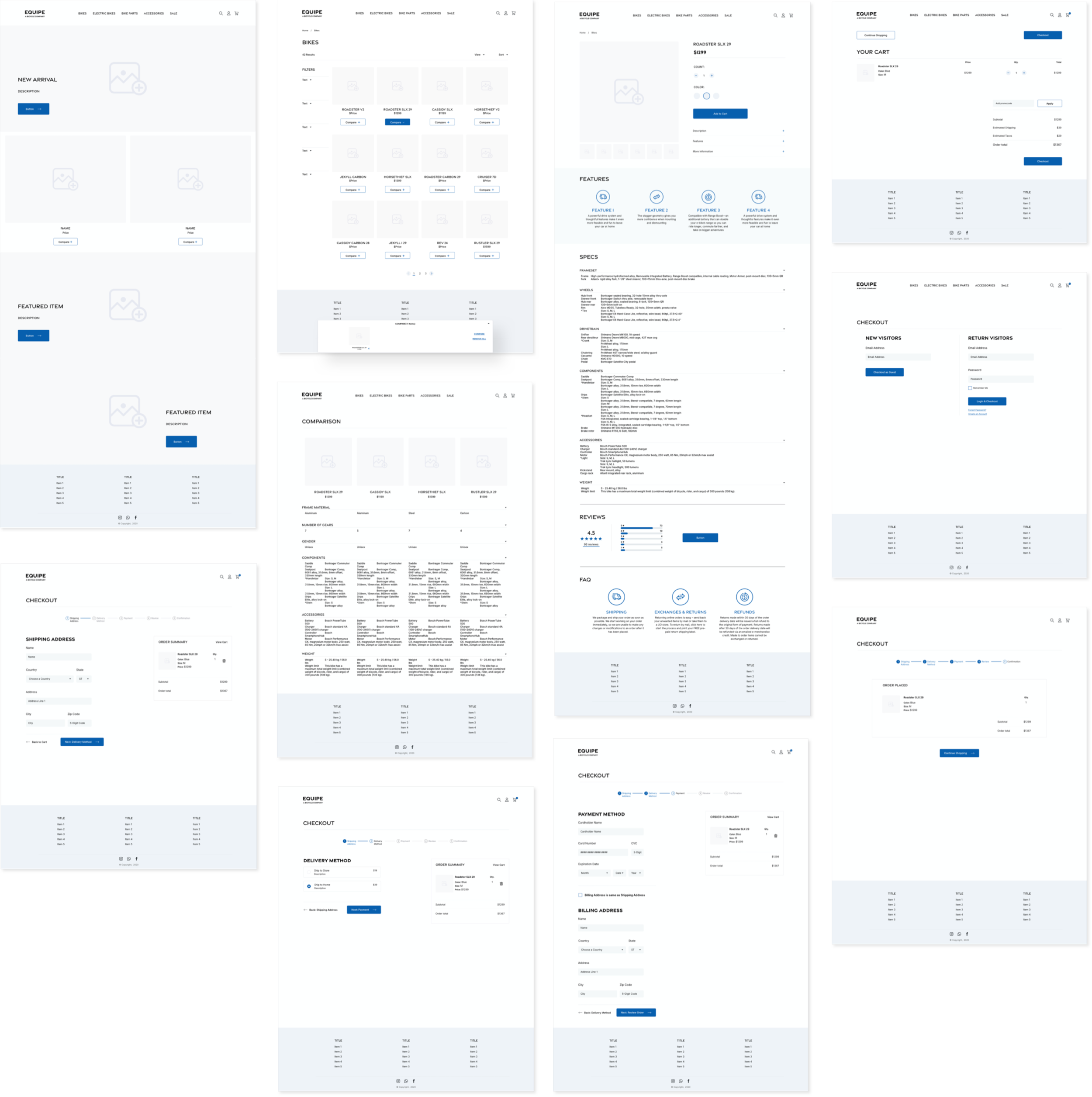
As a starting point, I determined the key screens I would need to wireframe based on the user flows created in the previous step of my design process. The essential screens were: Home, Catalog, Item, Shopping Cart, and Guest Checkout.
Wireframes
To ensure intuitiveness and encourage users to move from browsing to completion of checkout, I used the heuristics insights and commonalities I discovered from the Industry Leaders and Competitors analysis to create familiar page layouts. I wireframed the screens in Sketch with a simple and clean interface to avoid overwhelming the user, and created a simple click-through prototype using Marvel.
04.
Prototyping & Testing
Usability Testing #1
Low Fidelity Prototype
Tests were performed virtually through video chat on 5 male participants within the target demo age range of 24 - 38 years old. I asked the participants to share their screens and think out loud while completing tasks in the prototype.
My goal was to test how user-friendly the Comparison feature and Guest Checkout interface was and to look for areas for improvement based on what participants expected the features to do. I was also hoping to discover specs participants considered important when shopping for bicycles, so that I can create an efficient filter, which would also help solve Equipe’s problem of users leaving the site without adding any items to cart because they are unable to choose a bike.
Testing Results & Insights
After conducting the usability tests, I synthesized the responses and feedback from participants and created a Usability Issues chart in which I sorted the discovered issues into 4 levels of importance: Critical, Major, Minor, Normal (Aesthetic). In addition, I was also able to collect the bike specs that users find important that informed my design for the filter and the spec section.
Most Common & Critical Issues
01.
Confirmation page needs more excitement and next steps information and users were missing ETA of item and email confirmation.
02.
Most users tried an additional step of filtering or searching before using the Comparison feature.
03.
Users were confused what steps they were on during checkout because the UI design of the Progress Bar did not successfully indicate current and next steps.
04.
Users wanted to know more transparency in the carts’s price breakdown and see the cause and effect as they made checkout selections.
High Fidelity Prototype V1
Using the Usability Issues chart as a guide, I further developed the website in Sketch to a high fidelity prototype showcasing what the new and improved features would look like and how it would function. Some of the significant improvements implemented were creating a filter with the suggested specs from the user interviews and redesigning the progress bar UI in the Checkout process to better guide users during their purchase.
From there I developed a click-through prototype with Invision to conduct a second round of usability testing to see if the critical and major issues had been solved and what additional improvements were needed. The two major changes in the prototype is the clickability of the filter and the addition of a promo code route during checkout.

Usability Testing #2
High Fidelity Prototype
Tests were again performed virtually through video chat on 5 different male participants within the target demo age range of 24 - 38 years old. I asked the participants to share their screens and think out loud while completing the same tasks from the first round of testing in the prototype.
For this round of testing, I continued to evaluate if the Comparison feature and Guest Checkout was intuitive and improved product findability. I was also hoping to discover if the addition of specific bike feature information has made the site more helpful to potential bike shoppers and enthusiasts.
Testing Results & Insights
After conducting the second round of testing, I created another Usability Issues chart in which I sorted the discovered issues into 4 levels of importance: Critical, Major, Minor, Normal (Aesthetic).
Most Common & Critical Issues
01.
Additional information is needed for the specs in the Comparison feature to be helpful to most users who did not know what the Specs meant.
02.
Users wanted to leave the site before checkout to search for other similar bikes to compare and see if this one is the best deal.
03.
The promo code was forgotten by the time users reached checkout.
04.
Users looked for a detailed sizing chart to find the bike size they needed.
Final Product
With the learnings from the usability test, I reiterated the prototype a third time and addressed the issues discovered. I made improvements to the availability of help for shoppers and streamlined the potential promo code discount feature by adding a scrolling banner for promotions at the top of most of the pages. In addition, I improved functionality of the checkout process by redesigning the pages to reflect price breakdown changes as they completed checkout steps and further developing the Order Placed page layout and information.

05.
Next Steps
Learnings
This was a fruitful and important project for me to work on as it provided invaluable experience building and improving a product to align with business goals, involved a ton of usability testing, and gave me an opportunity to create detailed UI design for e-commerce.
The Future
Drawing on this experience improving Equipe’s web experience, I believe it is important to continue exploring different ways to guide shoppers through their bicycle research and selection process and provide more value to consumers than just the bicycles themselves.


