Move-It
Visual Checklist App
A Visual Checklist for Movers
The App
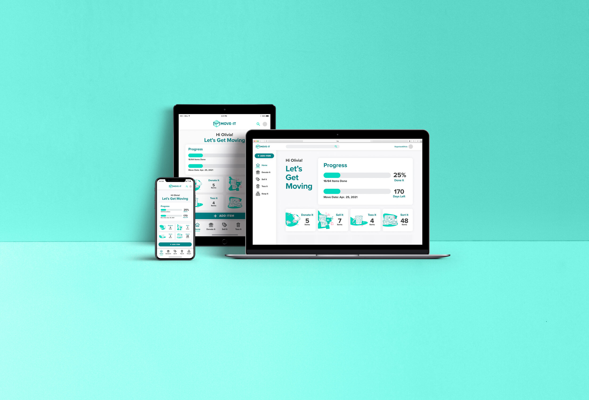
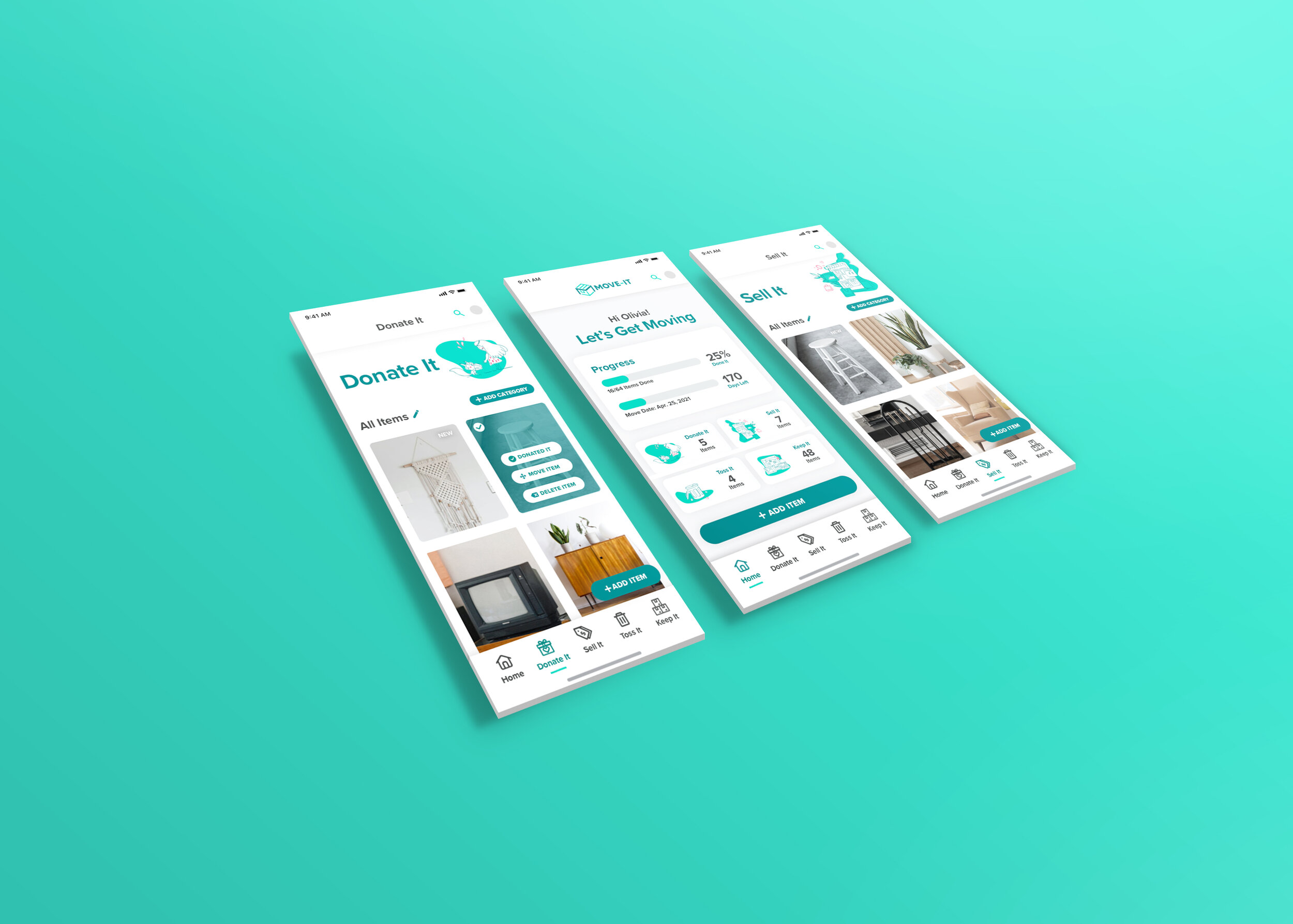
Move-It is a visual checklist app that helps users declutter and organize in preparation for their moves.
Moving is a notoriously tedious and stressful life event for people, and the challenge was designing a tool that makes the moving out process as exciting of an experience as moving in for users.
My Role
I identified primary pain points through interviews with recent movers, designed a solution, and iterated and validated through several rounds of guerrilla and usability testing to create the Move-It App prototype.
I conducted the user research and synthesized the discoveries to create empathy maps, personas, user journeys, and user stories, which was then used to wireframe, mock-up, and prototype the app design. Throughout the design process, I also conducted usability testing to inform the subsequent iterations.
Type
Organizational App
Duration
5 Months
Tools
Sketch, Invision, Miro, Marvel
Role
Secondary Research, User Research, Affinity Mapping, Empathy Mapping, Persona, User Story, User Flow, Heuristic Evaluation, UI Design, Branding, Wireframing, Sketching, Guerilla Testing, Design System, Prototyping, Usability Testing
The Problem
I Moved Twice in Two Years, and Both Times were Stressful.
The genesis of this idea stemmed from my own personal experience moving recently. I wanted to move to a bigger place to better accommodate my lifestyle, but the thought of moving was so daunting that I was willing to settle for another year in a space I have outgrown just to avoid 2 days of moving. Having come to this realization, I began evaluating why I was unwilling to go through a few days of inconvenience to move somewhere that would benefit me long term, and if this same mentality was prevalent among others as well?
The Solution
Process and Methods
01. Research
Secondary Research
User Recruitment
User Interviews
Redefined Problem
02. Insight
Affinity Map
Empathy Map
Personas
03. Ideate & Design
User Stories
Sitemap
User Flows
Sketches
Guerilla Testing
Design System
04. Prototype & Testing
Wireframes
Wireflows
Low Fidelity Prototype
High Fidelity Prototype
Usability Testing
05. Next Steps
Learnings
The Future
01.
Research
If moving is a pervasive issue, what was the root of the problem?
I began this case study by conducting secondary research through articles regarding moving and interviewing recent movers about their moving experiences and identifying the main issues that they encountered.
Secondary Research
For landscape research, I looked into several articles about the stress of moving, how to relieve the stress of moving, and best practices for moving.
Half of the articles contained moving tips or guides from initial moving prep up til the day of the move. These provided insight on what were the most common pain points for movers and how they could be solved. I also delved into readings on the psychological factor of moving and why it causes stress. I found that the psychological stress of moving is attributed to leaving a stable, constant place for an unknown that symbolizes hope, but could result in disappointment as well.
Psychological Effects of Moving
Common Moving Tips
“… moving is an intensely emotional experience... the hope for new beginnings, crushing disappointments, loss, anxiety and fear.”
— The Psychology of Moving, The New York Times
“The emotional impact of moving is in the top 5 most stressful situations we experience across a lifespan…”
— The Emotional Impact of Moving, Moving Mindsets Psychology Clinic
Sell, Donate, Toss unwanted items
Make a checklist
Pack early
Packing strategies
Scheduling movers/truck
Recruiting help
User Interviews
5 People
3 Women, 2 Men
30 Minute
Remote Virtual Interviews
Housing
Apartment, House, Townhouse
3 out of 5
Stressed by Moving
The Good
Having enough help from family and friends
Having the luxury of time to move out (both not stressful events had no deadline)
Close distance to move was a positive
Enjoyment and looking forward to a new place
“It’s more exciting to move in rather than to move out.”
-SM, 7 Moves in 10 Years
“If I had planned better, it would’ve been less stressful.”
-CM, 2 Moves in 2 Years
The Bad
Having too much stuff and either moving things unnecessarily or having the challenge of sorting and decluttering before the move
Finding the thought of moving too overwhelming and the anticipation to be really stressful
Physical strain of moving things
Wanting to save money
The Redefined Problem
The common thread in all the problem statements pointed to
the mental and emotional toll of moving being the biggest deterrent and stressor.
While the physical aspect of a move can be exhausting, my findings were that the emotional toll and mental load is the biggest struggle for most movers, and it is the pain point that creates a stressful experience.
After synthesizing the initial research, I was able to specify and redefine the problem of moving, and to kickstart my ideation, I created opportunity statements for solving this problem, the core of which was:
How might we make moving out just as exciting of an experience as moving in?
Opportunity Statements
How might we help people feel less overwhelmed when decluttering and organizing before a move?
How might we make professional moving services more approachable for those with no experience?
How might we make the physical aspect of moving less exhausting?
How might we encourage and motivate people to begin packing and moving preparations earlier?
02.
Insights
With the feedback from the interviews, I set out to solve the identified pain points through human-centered design techniques such as affinity mapping, empathy mapping, and personas.
Affinity Map
I started with an affinity map of notes from the 5 interviews, and as I sorted, several commonalities in everyone’s interviews started surfacing.
Empathy Maps
After synthesizing the interview feedback, I created empathy maps to consider what a potential mover would Think, Feel, Say or Do and what their pain points and goals are for a move. The points of view I used for the maps were a Budget Mover, Good Prepper, and Bad Prepper.
Personas
Then I created three user personas to focus my target audience and to help me develop subsequent user stories.

03.
Ideate & Sketch
User Stories
Based on the 3 personas, I created several user stories to help me prioritize the users needs during the moving process. Through the user story, I determined that the Minimum Viable Product for this moving solution would have:
A quote and booking feature for movers and truck rentals for the Planning phase
A decluttering and organizational component for the Preparing phase
A to-do task/checklist feature for the Moving Day phase
Initial Idea: All-In-One Moving App
Site Map
Following the user stories, I sketched out a rough sitemap that addressed all the user needs previously identified with a quote feature, organizational feature, a to-do task list feature, and a budgeting feature to tie in with the mover quote function. It helped me visualize how all the features would relate to each other.
User Flow
This led to the user flow map, which helps me identify how the user would ideally use this app for their moving needs. With this initial user flow, it became apparent that ambitiously tying together every solution into a one-stop-shop tool, the app itself became a form of clutter.
With this initial user flow, it became apparent that ambitiously tying together every solution into a one-stop-shop tool, the app itself became a form of clutter.
New Idea: Declutter App
As a result, I decided to pull back and narrow the focus on one primary function: decluttering. By easing the decluttering process, the app can relieve the physical strain of moving extra items unnecessarily, the overwhelming feeling of packing a lot of things, and the limitation of a tight budget by spending less on packing and moving supplies, which led me to a more focused app that was a solely a visual checklist that helps users sort and get rid of unwanted items before their move.
Site Map
User Flow
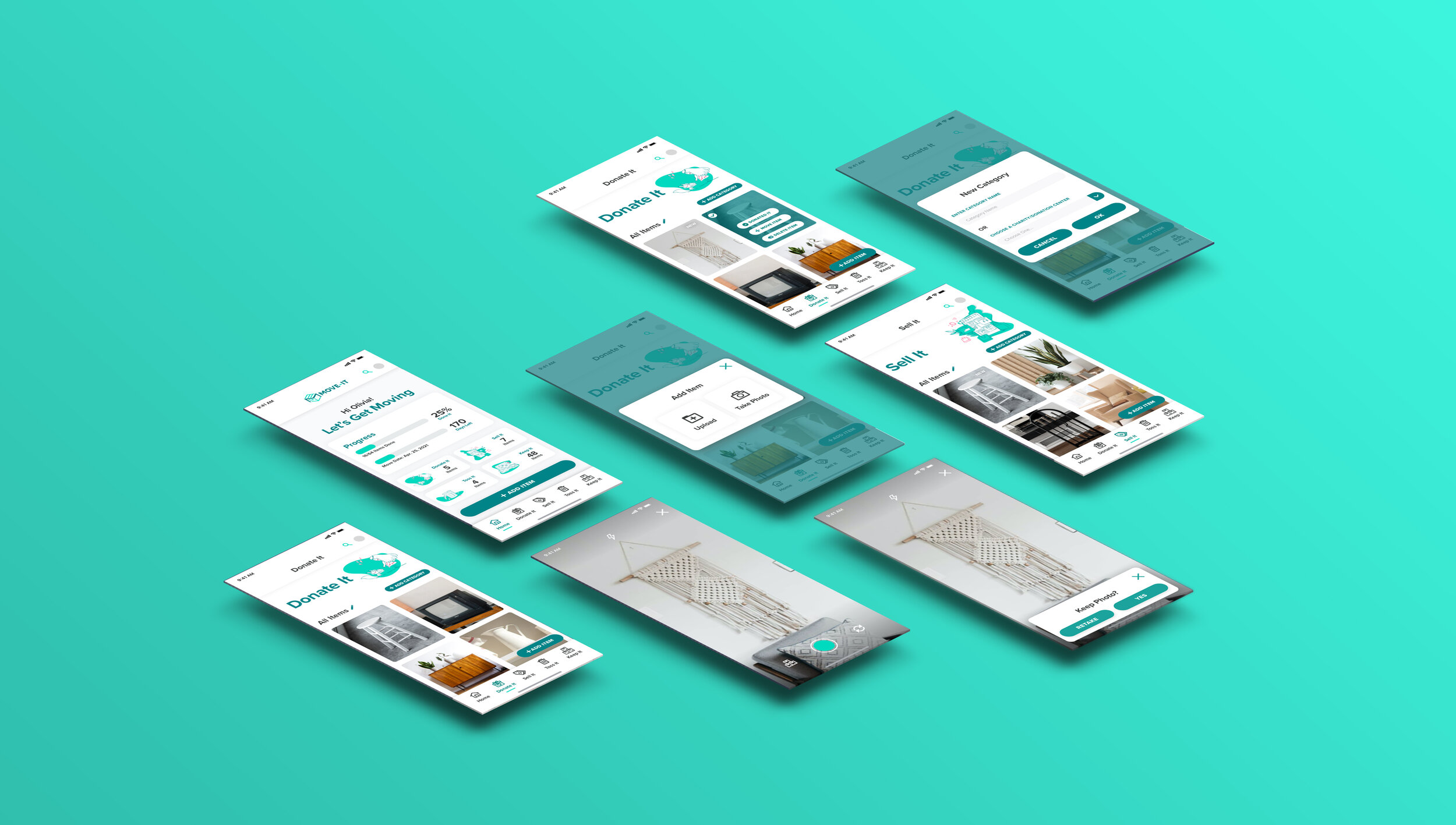
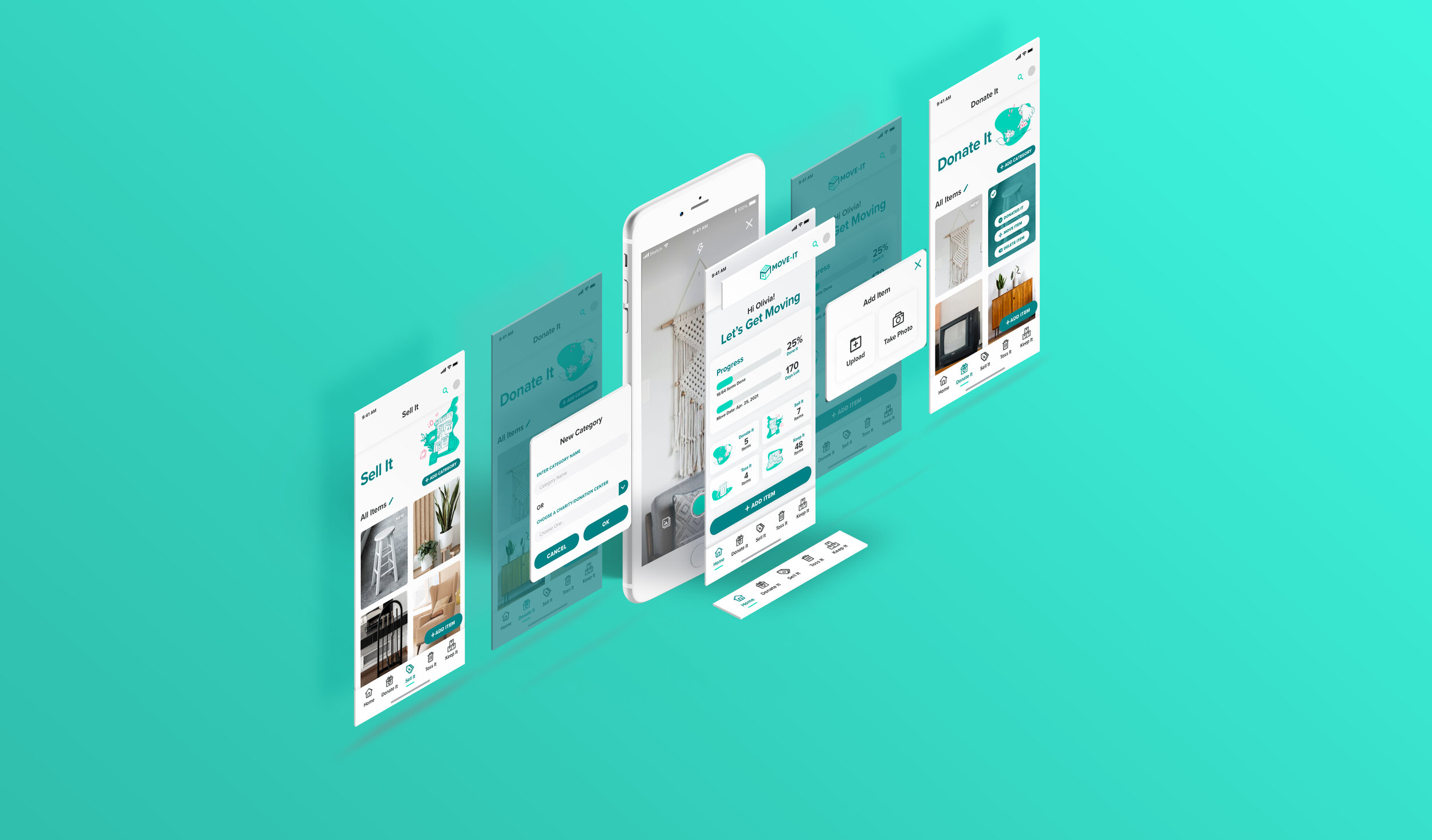
I circled back to the sitemap and user flows and simplified the app so that it would be easier to use and align with my primary goal of reducing stress for the user. In the second version of the user flow, I mapped out 3 main red routes that would be the primary actions within this app:
Add Item
Move Item
Add Sub-Category
By focusing the app on one main purpose, the app became simpler and easier to understand which I believe is key to attracting users to try and use the tool.

Sketches
I sketched out three red routes to begin visualizing the app concept. My goal is to destress the moving experience, and I believe creating a visual checklist to help users declutter and stay organized will lighten the mental load of tracking everything. It can also act as a beginner’s sorting guide.
How It Works
Users take photos of their item and then sort them into the three main decluttering categories, which per my research on decluttering best practices are: Donate, Sell, and Toss. I feel this provides the user with a starting point of how to best sort and organize their belongings for a move. Users can then intuitively check off these items as they donate, sell, or toss those items.
Add Item
Move Item
Create Sub-Board
Guerrilla Testing
To validate my concept, I performed a quick round of guerrilla testing with my sketches. I tested 5 people with a simple click-through Marvel prototype.
Navigation
The main navigation is the bottom tab bar for users to easily switch in between their digital lists. My original sketch design of using both a hamburger menu icon and a bottom tab bar created unnecessary confusion as to which was the primary menu, so that was eliminated during wireframing.
Terminology
The terminology in the app also evolved from the sitemaps so that the lists were now named Donate It, Sell It, Toss It, and Sort It to reflect the actionable nature of these lists. The initial term for the visual “boards” also reverted back to “lists” to reinforce this app as a digital checklist and not a moodboard.
Wireframes
Using the insights from the guerrilla testing, I further developed the app concept by wireframing the 3 red routes. I replace the hamburger menu with a back button that a couple of test users looked for during testing. Also, user feedback on the “Gallery” list was a lot of confusion and a suggestion was made for a section for items that the user plans to keep, so in the wireframe, I changed the “Gallery” list into the “Put Away” list.
Add Item
Move Item
Create Sub-boards
Branding & Style Guide
Brand Mission
Organizing and decluttering before a move can significantly destress and ease the moving process. We provide a delightful, visual tool that makes it easy to organize and declutter for a move.
Brand Personality
The Move-It personality is delightful in its use and encouraging to the prospective movers to face the challenge of decluttering head on.
Brand Attributes
Simple
Easy
Upbeat
Helpful
Cheerful
Inspiration
To begin ideating the visual design, I gathered inspiration based on what I believed would both meet the personas’ needs and match Move-It’s brand personality and attributes.
Design System
Color Palette
The primary color I chose is a teal green because green is often associated with peace and serenity and the app’s goal is to help calm the mental chaos and anxiety of the moving process.
Typography
Because Move-It’s brand attributes are “easy” and “simple”, I chose a modern but common sans serif fontface Proxima Nova for familiarity and legibility.
UI Components
Combining the typeface, colors, and inspiration, I put together a component library of buttons, icons, and other elements.
04.
Prototyping & Testing
High Fidelity Prototype V1
In Version 1 of the high fidelity mock-ups that would eventually come together as the click-through prototype, I created an UI with bright, minimalistic photos while keeping other graphic elements at a minimum to align with my goal of easing user stress with less clutter of UI elements.
The resulting design felt empty and joyless. I re-evaluated the app’s design direction and concluded that instead of bright photography, illustrations may add more whimsy and fun to the app’s look and feel, and also make it so that the only photography in the app were user generated. This also improves recognition over recall so that users immediately know any photography is an item and any graphic is a UI element.
Add Item
Move Item
Create Sub-Category
Round 1
Prototype & Usability Test
I conducted two rounds of usability testing with one prototype iteration between testing rounds. Through these two rounds of usability testing, I learned about the product’s weaknesses and strengths, and discovered the areas that needed improvement to meet the user’s needs.
Prototype V1
Using the high fidelity mock-ups, I developed a simple Invision click-through prototype to conduct user testing to see if the premise of a visual checklist was intuitive and more helpful than it was confusing for the users, and if it was confusing, identify the areas for improvement. While developing the first prototype, I considered a user’s feedback, and changed the unsorted/gallery view list label to a “Keep It” list. The “Keep It” list can hold all the items that movers plan to take with them. By using the unsorted list as a “Keep It” list, users have the flexibility to decide at a later time if they wish to sort the item into the other three lists.
Usability Testing 1
Overall, users understood the premise of a visual checklist and the “Add Item” route caused very little friction for users. In the first round of usability testing, I found there were a lot of minor usability issues, but the three major problems are as listed below and I addressed these issues by implementing the following updates in V2:
Problem #1
The primary actions “Move Item” and “Add Sub-Category” lacked visibility and discoverability while living under the Edit options.
Solution
Decoupled the “Move Item” and “Add Sub-Category” options out of the “Edit” menus to make these primary actions more visible.
Problem #2
The Progress Bar function was not immediately understandable.
Solution
Changed the terminology from “Got Moving” to “Items Done” and added a target move date progress bar.
Problem #3
The sub-category screen and navigation needed further clarification.
Solution
When one or more sub-categories are created, an “All Item” sub-category is created as well to show users that the sub-categories are filters and the top row of pill buttons are navigation buttons.
Round 2
Prototype & Usability Test
Prototype V2
Using my findings from the first usability test, I reiterated on the first high fidelity prototype and created version 2 of the click-through prototype in Figma.
Usability Testing 2
In the second round of usability testing, I observed that the primary action usability greatly improved and users were able to perform these actions much more easily. I also discovered several new areas for improvement, but a few of the major critical problems were:
Problem #1
Despite renaming, the Progress Bar measurement and function remained confusing for users
Recommendation
Need to rename “Items Done” to a more straightforward name such as “Items Checked Off”.
Build out checklist function to make clear how the progress bar is to be used for users.
Problem #2
The “Sort Item” step of the “Add Item” route felt redundant for users when adding the item from within a specific list already.
Recommendation
Remove sorting step in “Add Item” route when adding item from any screen except Home.
Disable origin list on the pop-up with the Move Items options.
Problem #3
Edge Case: Users were able to add a custom name and choose a dropdown menu option within the Create Category screen concurrently.
Recommendation
If value entered into the custom name field, then dropdown should be disabled. If dropdown option selected, then custom name field should be disabled.
Final Product
Improved Usability on the Primary
Function of the Prototype
Through interviews and research, I gained a deeper understanding of the user’s pain points during their moves and the resulting emotional strain. My goal was to relieve the stress of moving, and after identifying the major hurdles a prospective mover had to overcome, I decided to focus on helping users declutter and organize by doing so, users can streamline the subsequent steps in their moving process.
The insights and feedback I learned from the rounds of guerilla and usability testing was integral for me to develop an app that met users expectations and anticipated their needs. With the improvements made from the first round of testing, users were able to perform all three red routes with little to no friction during the second round of testing. The concept of a visual checklist was intuitive, which I believe is a sign that this app is heading in the right direction in becoming an easy-to-use tool.
The insights from the second round of testing have yet to be implemented in the prototype. Despite the overall success of user task performance, I realized there is still more work to be done for the app to truly make the moving out experience as exciting as the moving in experience for users.

05.
Next Steps
Learnings
This project provided invaluable experience in taking a project from inception to high-fidelity prototype. I was able to learn how to identify user pain points and focus on the primary causes of friction in a user’s life. I was also able to apply UX methodologies in synthesizing research, ideating and sketching solutions, and then create prototypes to test and validate my solution.
This app not only solidified my understanding of the UX design process, but also instilled in me the importance and efficacy of human-centered design.
The Future
Once the MVP is fully developed, I believe this app has the potential for helpful add-ons such as a marketplace integration in the Sell It list, in which users can choose to list their Sell It items on the marketplace when adding item to the Sell It list for a seamless addition to both the checklist and the marketplace.
Also, to further relieve the physical tedium of moving, the app could feature a function in which users can scan a Move-It app generated QR code printed onto physical labels for their moving boxes, and be able to see in the Move-It app which items are in the physical box.


